
A stick of charcoal, a piece of chalk: along with the reds, yellows and browns that occur naturally in the earth, these ancient artists’ materials have been with us since the first cave paintings were made more than 28,000 years ago.
They are links in what David Coles, paint expert and the author of Chromatopia, a new book on artists’ colours, calls “a ‘golden chain’ of history”, connecting the art of today with the first marks ever made.
These basic organic materials are a rare constant in the dramatic – and colourful – history of colour. From the gruesome business of harvesting the mucus of predatory sea snails to arduous journeys along the Silk Route, to the lethal concoctions produced by alchemists, extraordinary lengths have been gone to in order to acquire pigments that, when mixed with oil, or egg or glues, yield beautiful, reliable artists’ colours.
Before the advent of commercially manufactured, pre-mixed paints, the pigments available to artists were of variable quality and longevity: plant-based colours, like saffron yellow, were prone to fading, and others, like lead white, would turn black.
Seen today, a painting from the pre-modern era is likely to have altered quite considerably from its original appearance, and the aging of pigments is a major reason why.
Flesh tones in medieval paintings can appear green now, because the pinks in the upper paint layers have faded to reveal the green ground layer beneath.
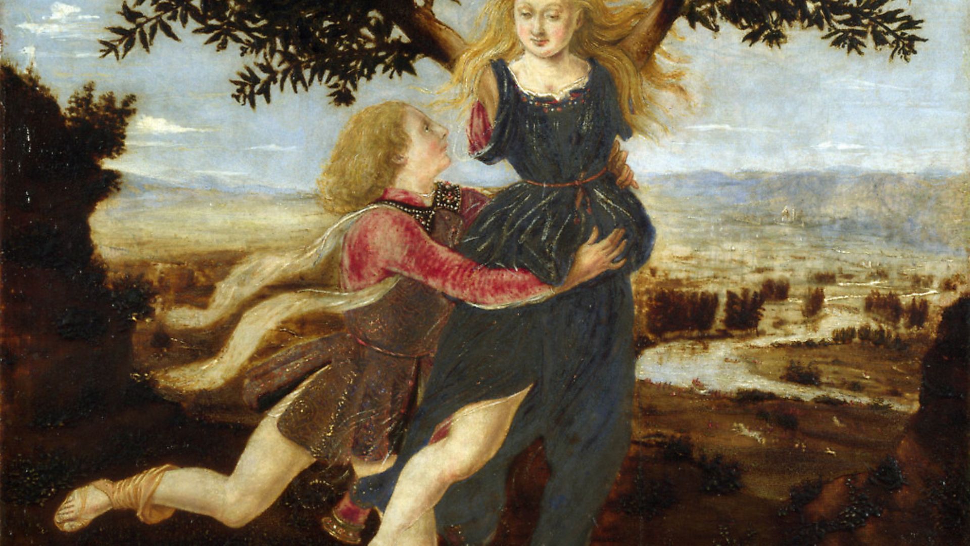
When a plant-based yellow fades, what once was vivid green foliage now appears blue; Piero del Pollaiuolo’s Apollo and Daphne, probably 1470-80, in the National Gallery is a dramatic example of how emerald green copper resinate degrades over time to an opaque brownish black.
Artists and their patrons were also limited according to geography and cost, and the pigments they could choose from varied from one period to another as new discoveries were made. Pigments have a profound effect on the ways paintings look, are an important means of locating where and when a painting was made, and can even help to identify an individual artist’s hand.
Though the history of art tends to be thought of as collected accounts of changing styles, influenced by artistic, social and political factors, it is equally a history of materials.
In the 19th century, a wide range of vivid synthetic pigments became available, supplied for the first time ready to use in squeezable metal tubes. Paintings like Seurat’s Bathers at Asnières, 1884, and Monet’s The Water Lily Pond, 1899, make full use of this newly-expanded palette, and portable tubes allowed artists to work outside more easily, in accordance with the Impressionists’ commitment to naturalism.
The impact of commercially available paints is not to be underestimated: according to his son Jean, the painter Pierre-Auguste Renoir said: “Without paints in tubes, there would have been no Cézanne, no Monet, no Sisley or Pissarro, nothing of what the journalists were later to call Impressionism.”
The most significant new pigment of the 19th century was cobalt blue, which was first manufactured in France in 1807, and appears in almost every area of Seurat’s monumental painting, Bathers at Asnières.
It appears in the sky and the water, in the skin tones of the figures on the banks and in the river, and even in the green of the grass, the liberal use of brilliant blue a characteristic feature of Impressionist and post-Impressionist painting.
The invention of cobalt blue was a revelation. For centuries before, blue had been the most troublesome of colours: as a primary colour, needed in mixtures with other colours but equally indispensable as a pure colour in skies, water and draperies, blue was unavoidable, but the pigments available were drab and weak, or prone to discoloration.
The only exception was ultramarine, a blue extracted from lapis lazuli and prized for its brilliant colour and superb staying power. Cennino Cennini, the 15th century author of The Craftsman’s Handbook describes it in almost mystical terms, writing that it is “illustrious, beautiful, and most perfect, beyond all other colours; one could not say anything about it, or do anything with it, that its quality would not still surpass”.
Its only known source was in Afghanistan, and its name, ‘ultramarine’, meaning ‘beyond the seas’, evokes something of the wonder attached to this astonishingly vivid colour, that came from the distant mysterious east.
As a crucial point on the trading routes between east and west, Venice was the dominant maritime power in Europe until the 17th century. The city became the centre of the pigment trade and Venetian painters had access to an array of precious imported pigments: rich colour, innovatively used, became the most celebrated characteristic of Venetian painting.
Titian’s Bacchus and Ariadne, 1520-3, in the National Gallery, London, is an example of Venetian painting of the most elite sort, its jewel-like colours exemplifying the lavish use of a range of rare and precious materials.
On the left of the painting, the vermilion of Ariadne’s sash contrasts with Bacchus’s fluttering draperies, which are painted in a red lake pigment, prized for its translucency and typically made from crushed insects.
The vivid orange draperies of the figure on the right carrying cymbals are painted in a rare – and lethal – pigment called realgar which contains arsenic, while the blue of her dress is ultramarine, which is used liberally throughout, occurring again in Ariadne’s dress and in the blue of the sky. The sheer amount of ultramarine marks it out as a costly, luxury object and the painting was one of a series commissioned in around 1510 for the palace of Alberto d’Este, the Duke of Ferrara.
Costly as it was, ultramarine was widely used in European, particularly Italian, painting of the Middle Ages and Renaissance, and was available to anyone who could afford it. By way of a contrast, Tyrian purple, a pigment said by the ancient Greeks to have been discovered by Hercules, was heavily restricted.
According to David Coles, in the ancient world only the Roman emperor was permitted to wear it, and “extreme penalties were imposed on those not sanctioned to own purple garments, including the loss of property, title and even life”.
The most prized form of Tyrian purple resembled clotted blood, and it was obtained from sea snails found in the eastern Mediterranean. The snails will secrete the dye if attacked, but the most efficient way of extracting it was simply to crush the snails.
Coles notes that one snail yielded a single drop of dye, with 250,000 snails needed to produce an ounce. “During the height of its production in the Roman Empire”, he writes, “the putrid stench of millions of decomposing snails meant its manufacture was banished to the edge of town.”
Though the method for producing Tyrian purple was lost after the fall of Constantinople in 1204, and was not rediscovered until 1998, the colour purple’s association with royalty has continued to this day.
Distasteful and unpleasant processes were not confined to the production of Tyrian purple, and the remains of Egyptian mummies surely constitute the most macabre ingredient of all. Mummy brown was popular in the 18th and 19th centuries, when foreign visitors to Egypt could wander unchallenged among ancient graves, breaking off body parts to bring back to Europe, where the fragments were prepared for use as a translucent brown colour that finally fell out of fashion in the 19th century.
If the industrialisation and scientific advances of the 19th century heralded the end of a largely unsatisfactory artists’ palette, it was only the beginning of a new chapter in the history of colour. In the 20th century scientists continued to develop new formulations, producing ever more lightfast, chemically stable and chromatically intense pigments.
Today’s artists have unprecedented access to affordable, high quality paints, but the age-old urge to produce unique, carefully-guarded formulations has not entirely gone away.
In 1957, the painter Yves Klein registered International Klein Blue as a trademark for the formulation of synthetic ultramarine he used in his famous monochrome paintings.
For Klein, his blue embodied some eternal, transcendental state, and he said: “At first there is nothing, then there is a profound nothingness, after that a blue profundity.”
More recently, the mystical allure of colour has drifted into farce, as one of Britain’s best known artists, Anish Kapoor, bought the rights to Vantablack, which at the time of its development in 2014 was the darkest substance known to humankind.
Developed for use in cameras and telescopes, the black reflects almost no light at all. When Kapoor secured the exclusive rights to use the black for artistic purposes, the artist Stuart Semple retaliated by developing a series of paints that he made available to anyone except Anish Kapoor.
In January this year, Semple launched Black 3.0, which he claims absorbs even more light than Vantablack. Previously, he had developed the world’s pinkest pink: when Kapoor eventually got hold of a sample, he posted a picture on Instagram, his middle finger dipped in the colour and presented to the camera.
The history of colour offers a view of human nature through a prism of enterprise and cruelty, innovation and ambition, but it seems likely that the Kapoor-Semple feud – still ongoing – may prove to be the most absurd episode yet.
Chromatopia: An Illustrated History of Colour, by David Coles, is published by Thames & Hudson
 Most popular


Farage is forced to explain his finances


Biden’s long-awaited decision is game-changing


Sanity is coming home

Trump is losing it